Case study
Mapping earthquake exposure
Folha de S.Paulo
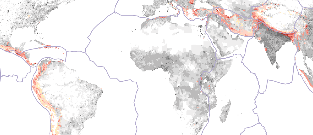
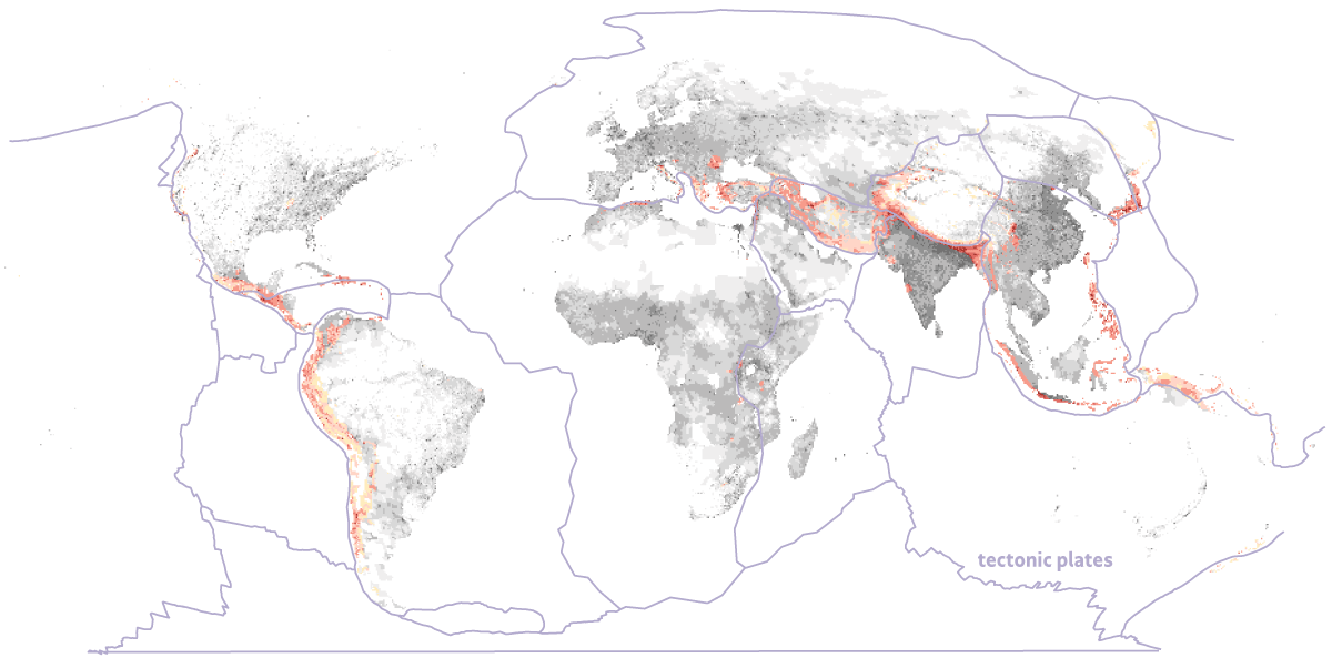
The piece, created in partnership with Gustavo Queirolo, establishes how many people live under significant earthquake hazard worldwide: about 1.41 billion. We arrived at the figure by overlaying probabilistic seismic hazard data against a global population raster. The April 2024 earthquake off the east coast of Taiwan prompted the work.
Background and context
Seismic hazard is published as peak ground acceleration (PGA), expressed as a fraction of Earth's gravity. The Global Earthquake Model's world hazard map gives, for every point on the globe, the PGA with a 10% chance of being exceeded in the next 50 years. Tehran falls in the 0.19–0.55 g band. GEM assembles this from national and regional hazard models built on historical seismicity.
The second layer is population density from CIESIN at Columbia University, a raster in which each pixel carries people per km², built up from national censuses.
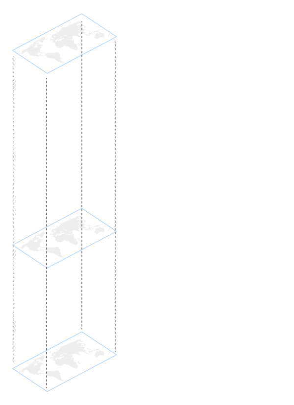 From the global earthquake model, only areas with a 10% chance of shaking at 0.1 g or greater over the next 50 years were selected. (0.1 g is 10% of Earth's gravitational force.) Those areas were overlaid onto a second map: population density, in inhabitants per km² The population living in areas at 0.25 g or above, where large rigid structures become vulnerable, was then calculated.
 Neither dataset defines "under threat" — that threshold had to be set editorially, and the resulting figure depends heavily on where it falls. I worked with seismologists at the Observatório Nacional, USP's Centro de Sismologia, and UFRN's seismological laboratory to settle on 0.25 g, the point at which large rigid structures become meaningfully vulnerable. The threshold is stated plainly in the piece. Below 0.25 g, damage still occurs, depending on construction type and how well the material dissipates energy.
The two layers arrive at different resolutions, so the hazard raster was resampled onto the CIESIN population density grid before any pixel-by-pixel comparison. Both were reprojected to Robinson for the published map. Converting density to counts requires true cell area, which varies with latitude in a 30-arc-second grid, so the population sum runs on the unprojected grid and Robinson is used only for display. Rendering the result meant showing a continuous density surface and a banded hazard scale in the same frame without either one obscuring the other.
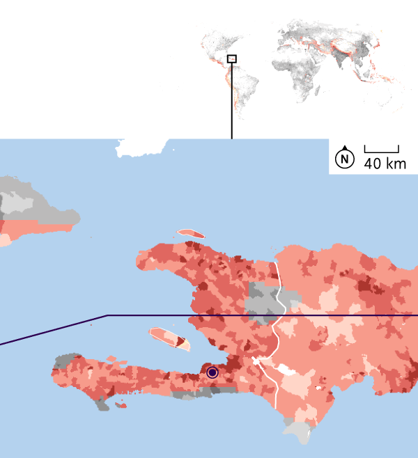 Port-au-Prince tectonic plates
 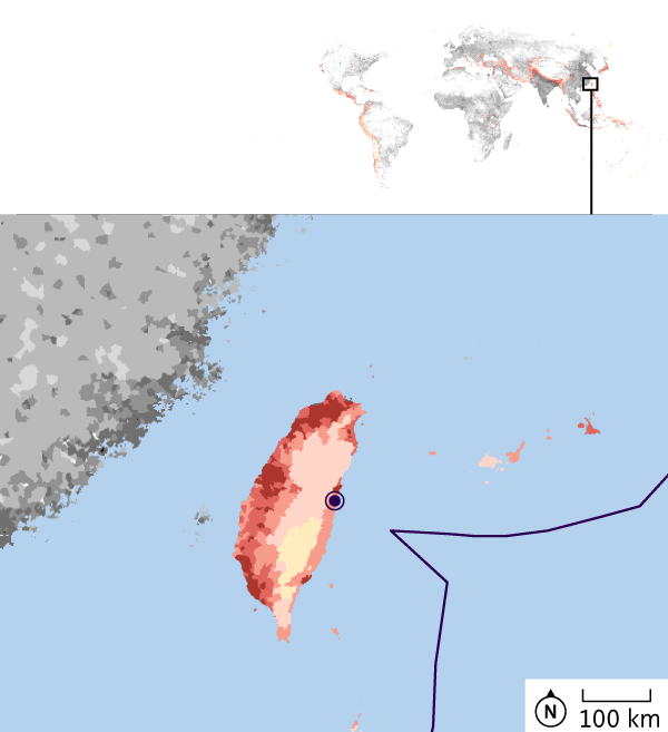 TAIWAN tectonic plates
 Findings and implications
The exposed population traces the plate boundaries almost exactly. The map's contribution is showing how much of that boundary is densely settled. Haiti sits in the highest band, and the 2010 earthquake there remains the deadliest in a century, with 316,000 dead.
Hazard is not risk. Every seismologist I spoke to raised this independently, so the distinction is built into the structure of the piece. Two places with identical PGA can have completely different outcomes depending on soil, building stock, and public preparedness. Taiwan is the clearest case: a magnitude 7.6 earthquake in 1999 killed nearly 2,400 people and triggered a rebuild of the country's construction rules; the 2024 earthquake that prompted this piece killed 18.
Note
The version published in April 2024 gave the figure as 1.73 billion. That calculation summed GPW density values directly, which treats every cell as exactly 1 km². At 30 arc-seconds, cells are smaller than that and narrow further with latitude. Recomputing with true cell area gives 1.41 billion. The pipeline now validates by summing the unmasked raster and checking the result against GPW's published global total.