Diana Yukari
visual | narrative | data
Diana Yukari
visual | narrative | data
Designing and building for complicated data
Description
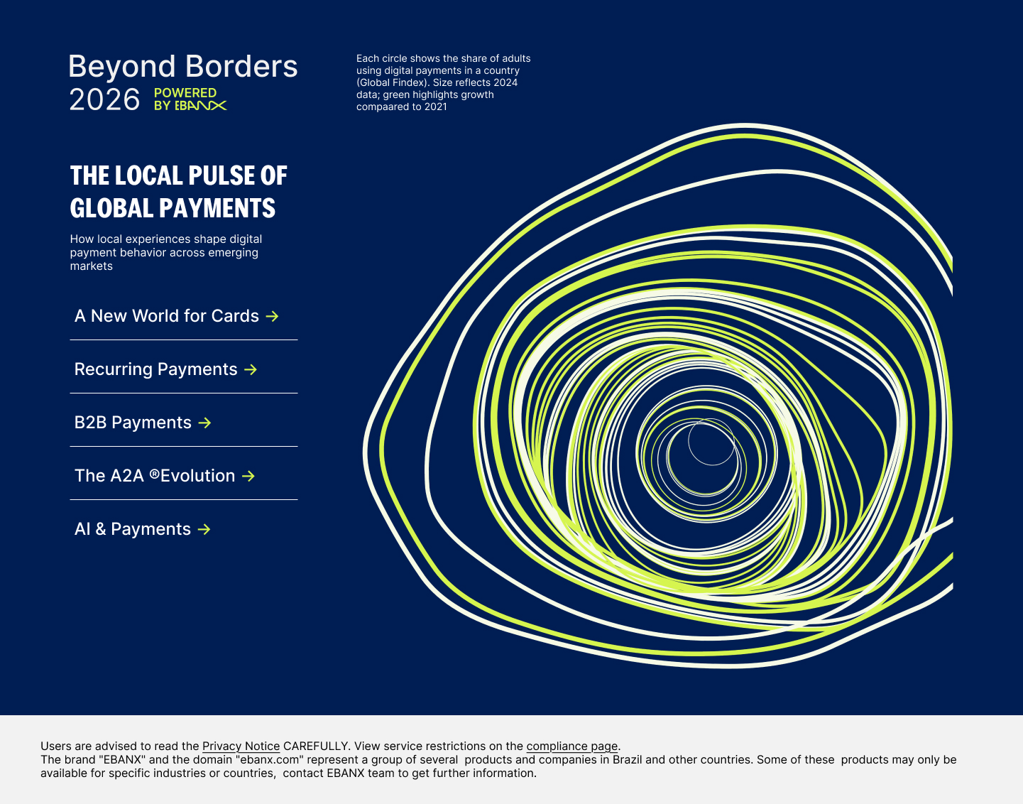
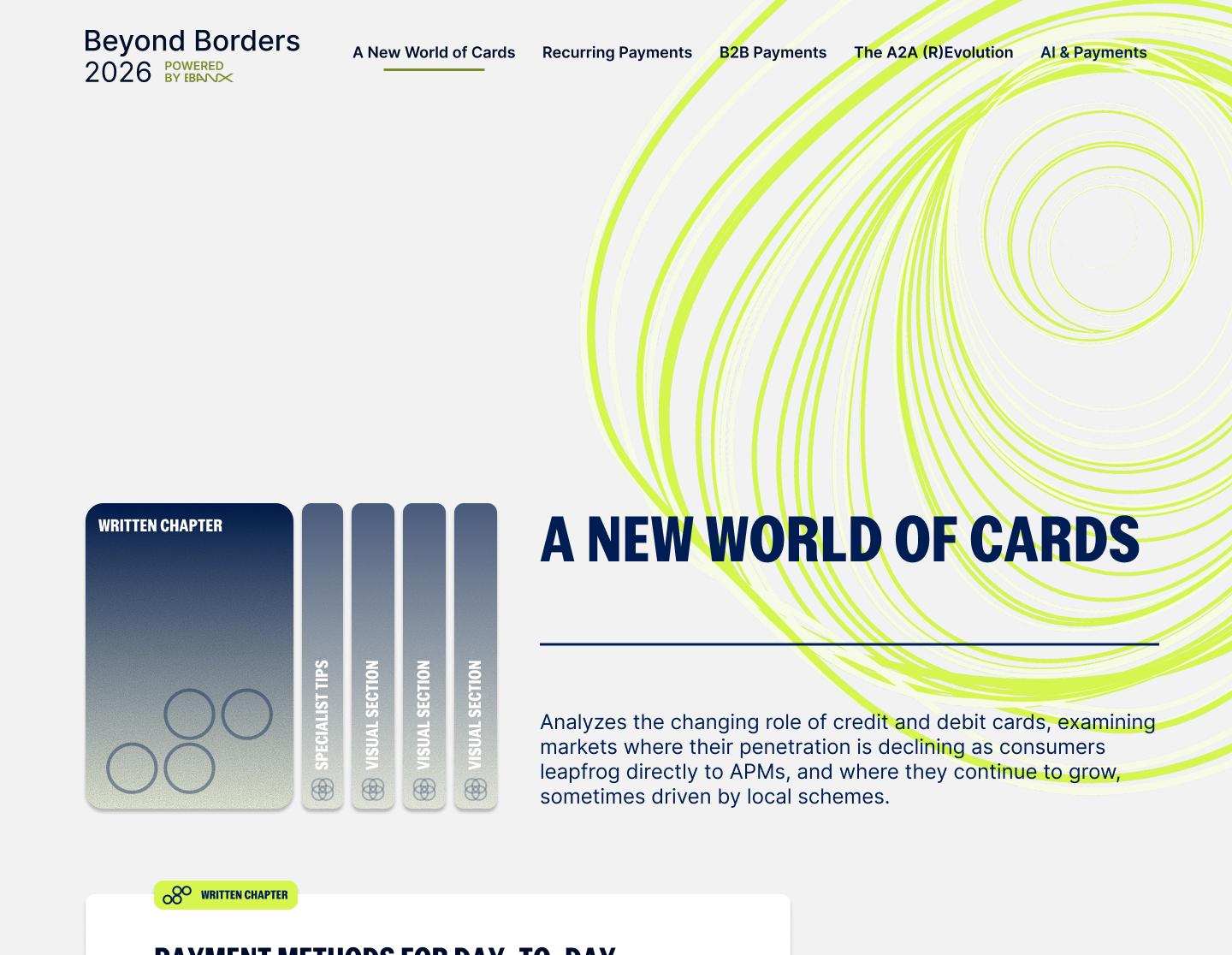
A generative visual identity for EBANX's annual report, built in p5 as a 3D Perlin noise orbit where each circle is a country sized by the share of adults making or receiving digital payments.
Role
- Design
- Creative coding
Solution
Gave a report about global payments an identity that was made from its own dataset, so the visual system and the findings stayed in sync. EBANX's in-house team then used the orbit for the launch assets.
Focus
- Generative system with rules
- Handoff to a team that kept using it
Design | Creative coding
Building a visual system from the report's own data
EBANX, 2026
Gave a report about global payments an identity that was made from its own dataset, so the visual system and the findings stayed in sync. EBANX's in-house team then used the orbit for the launch assets.
Description
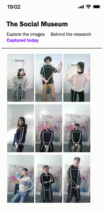
An installation and website about how people pose with artwork in 2,251 Instagram photos taken inside modern and contemporary art museums.
Role
- Design
- Data
- Front-end development
Solution
Designed one experience across two touchpoints, a camera installation and a take-home website, so visitors grasped the research by standing in front of it. Their portrait lands on the site with everyone else captured that day. In collaboration with Kosara Keskinova.
Focus
- Installation-to-website journey
- Filtering a large image set
- Research protocol open to visitors
Design | Data | Front-end development
Letting visitors see their own pose matched to strangers' museum photos
The Social Museum | DAE, 2025
Designed one experience across two touchpoints, a camera installation and a take-home website, so visitors grasped the research by standing in front of it. Their portrait lands on the site with everyone else captured that day. In collaboration with Kosara Keskinova.
Description
Folha's palette was small enough that charts kept reaching outside it. I expanded it in keeping with the paper's visual identity, then defined which combinations to use and what each one means. The new palette replaced the old one across the newsroom.
Role
- Design System
- Research
Solution
The old palette forced designers to invent color combinations on the spot, so charts drifted from their meaning. The expanded set gave each combination a job, and every pair was checked for accessibility.
Focus
- Expanding a palette within an existing identity
- Semantics: categorical, sequential, diverging
- Accessible contrast and colour-blind safety
- Adoption across a newsroom
Design System | Research
Helping newsroom designers hit the brand palette without deciding color every time
Folha de S.Paulo, 2022
The old palette forced designers to invent color combinations on the spot, so charts drifted from their meaning. The expanded set gave each combination a job, and every pair was checked for accessibility.
Description
Fans swap songs into Taylor Swift's Eras Tour setlist and compare how their version's positivity, danceability and energy curve against the original.
Role
- Design
- Front-end development
Solution
Turned a data analysis into something fans could play with. The original setlist stays on screen as a baseline while the edited curve updates, and each bar plays its track.
Focus
- Multi-metric encoding
- Editing as the core interaction
- Built and shipped in a newsroom
Description
Two interactive tools that let readers redistribute votes state by state and see the national result change. The second-round version asked where eliminated candidates' voters would go.
Role
- Design
- Front-end development
Solution
Turned state-by-state election results into a tool readers could use on their phones. The same interaction carried into the second round, so the newsroom shipped a second tool on deadline without readers relearning anything.
Focus
- Constrained input design
- One pattern reused across two tools
- Shipping on a news/election deadline
Design | Front-end development
Run Brazil's election across 27 states
Folha de S.Paulo, 2022
Turned state-by-state election results into a tool readers could use on their phones. The same interaction carried into the second round, so the newsroom shipped a second tool on deadline without readers relearning anything.
Description
Graphics for Folha's print edition, from daily charts to full-page features, made across five years at Brazil's largest newspaper. In collaboration with journalist of different desks across the newsroom.
Role
- Design
- Data
Solution
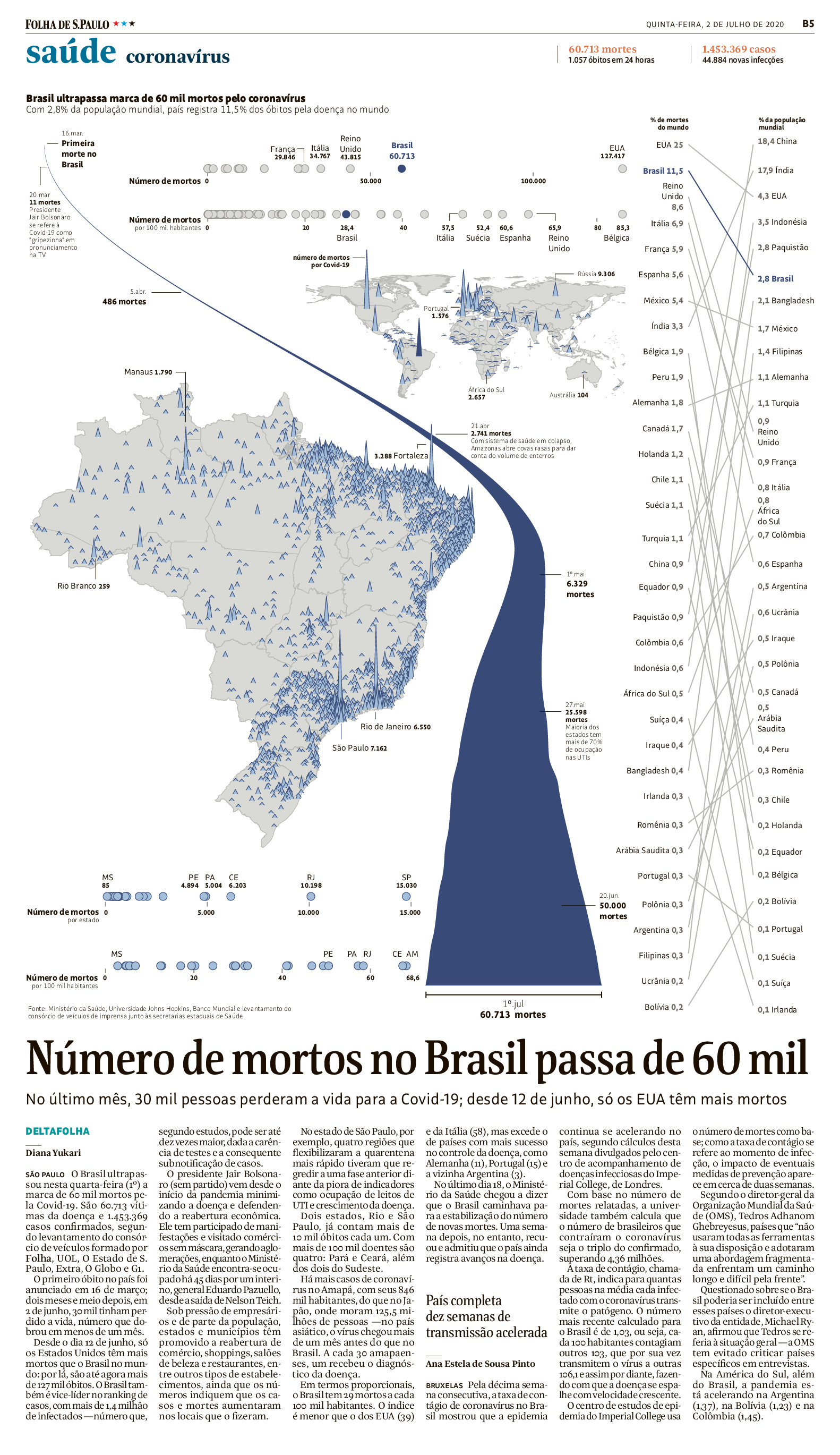
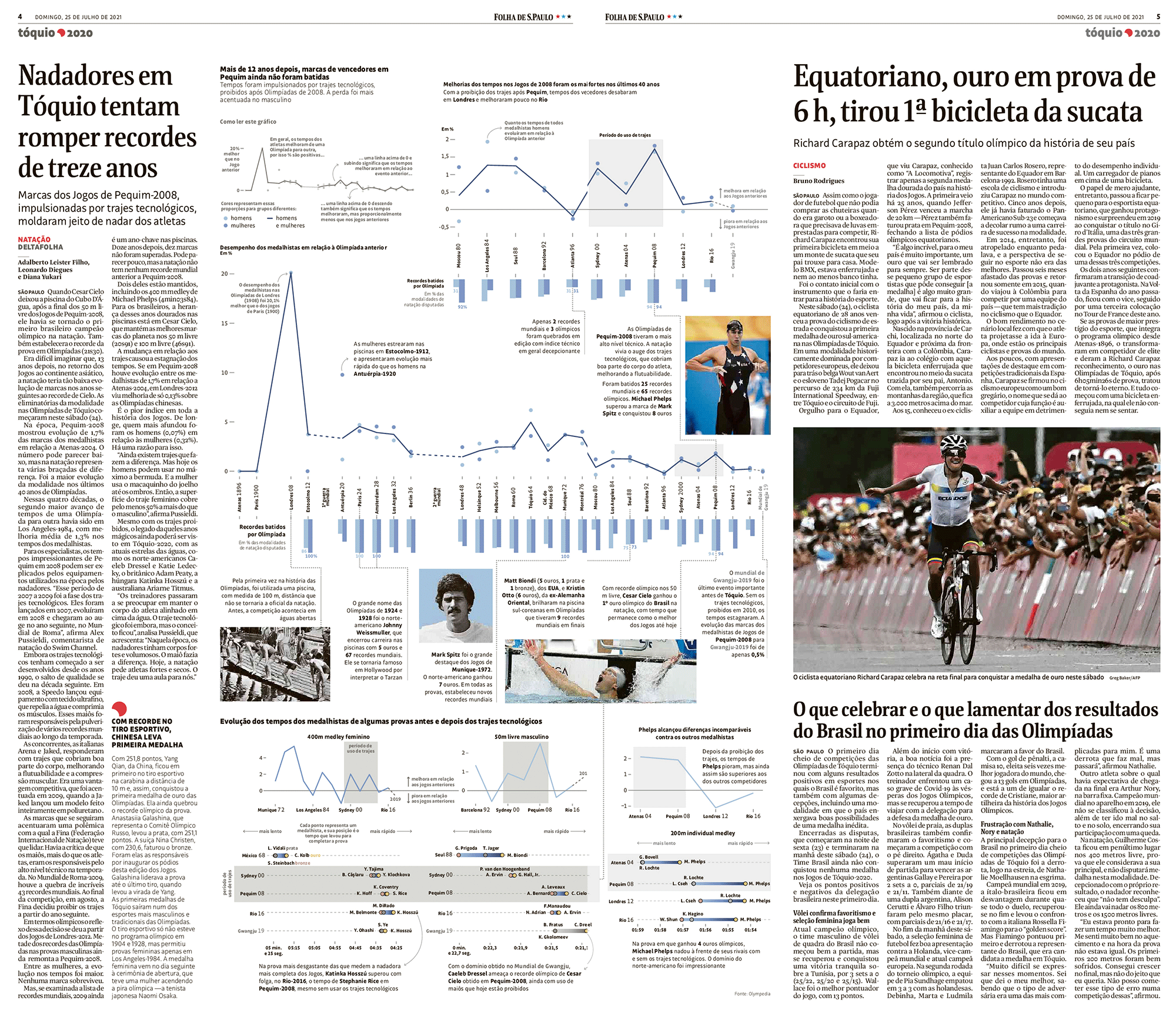
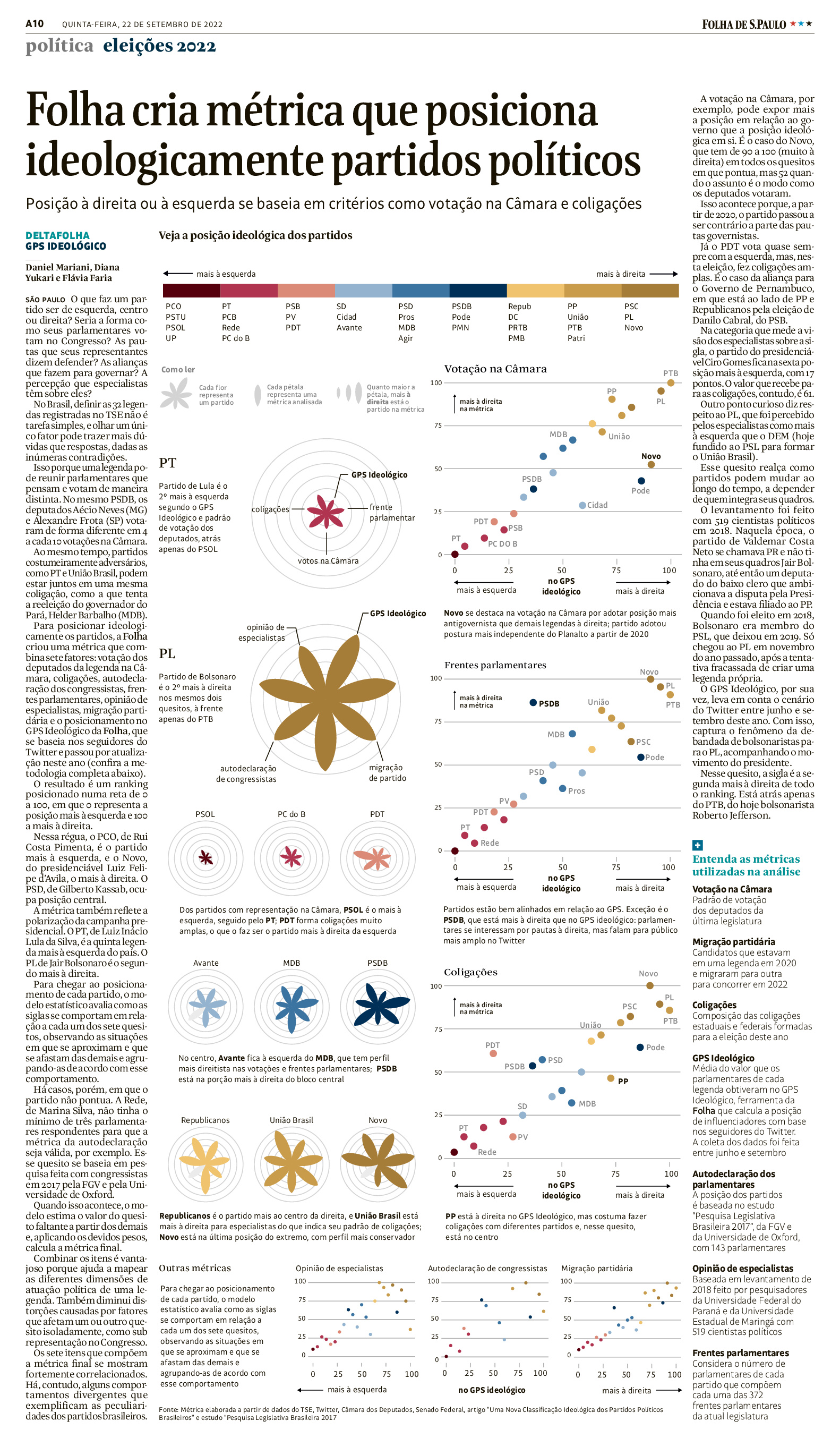
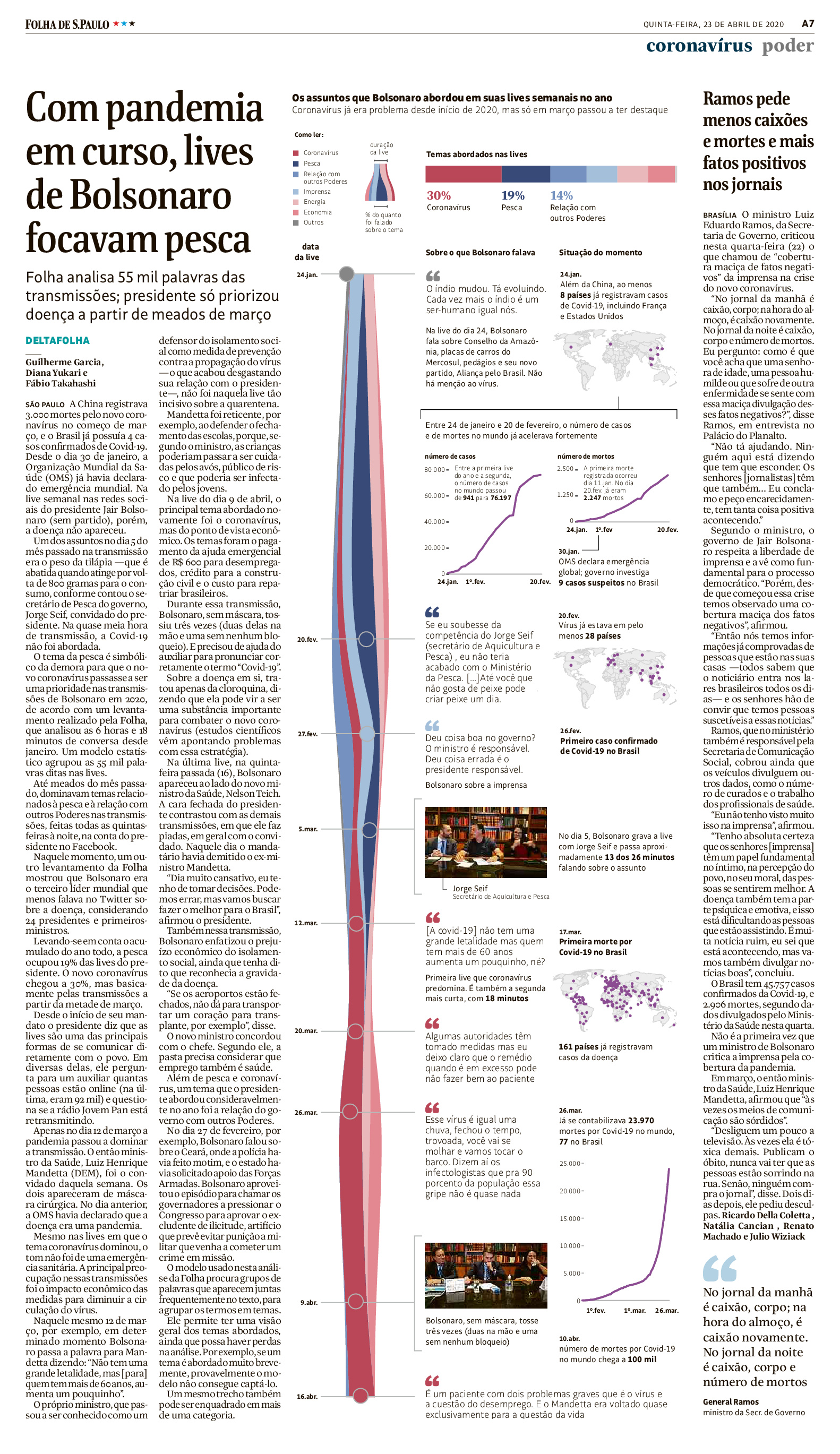
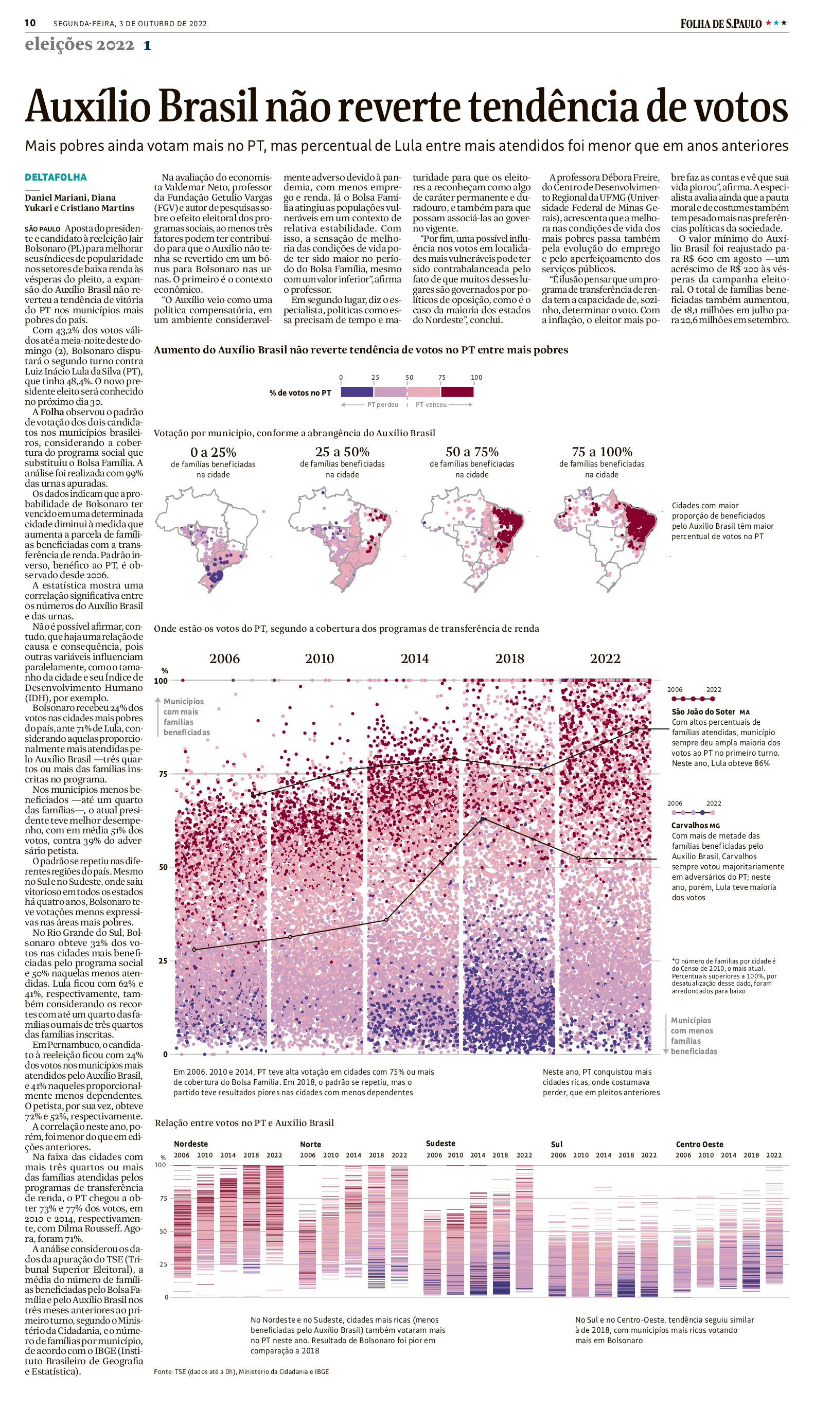
Newspaper stories often turn on data that won't reduce to a single number: several variables moving at once, patterns that only show at full resolution, exceptions that matter as much as the trend. The print graphics kept that density on the page and organised it through hierarchy, annotation and layout, so a reader could take in the headline finding at a glance and then stay to read the detail underneath.
Focus
- Editorial judgment under deadline
- Fixed formats and column widths
- Hierarchy without interaction
Design | Data
Print work
Folha de S.Paulo, 2019-2024
Newspaper stories often turn on data that won't reduce to a single number: several variables moving at once, patterns that only show at full resolution, exceptions that matter as much as the trend. The print graphics kept that density on the page and organised it through hierarchy, annotation and layout, so a reader could take in the headline finding at a glance and then stay to read the detail underneath.
About
Diana Yukari
visual | narrative | data
Previously
- Creating data first products@Folha de S.Paulo
- Leading a data journalism team@Folha de S.Paulo
- Telling stories@G1
- Illustrating stories@Business Insider
Education
- BFA in Visual Communication@School of the Art Institute of Chicago
- MA in Information Design@Design Academy Eindhoven
Skills
- Visual Direction
- Complex Subject Translation
- AI prototyping
- Creative Coding (p5, D3)
- Cartography & Geospatial
I'VE BEEN THINKING ABOUT
Like most people, I've been thinking a lot about AI. I had a conversation with a designer friend who never had the time to learn how to code but had oh so many ideas on paper. He became what I personally consider an AI-native designer, someone who from the beginning was really excited to use it to realize all of the ideas he already had sitting in his mind. He ships more than I ever did, and I'm amazed to see it. This is the use I aspire to, though: it never designs, it never creates the actual output. It is, more than anything, another tool, albeit a powerful one. I'm cautiously excited because I still feel guilty about using it while it drains resources from the planet.
I'm also obviously thinking of life after getting my Master's. I haven't had to look for a job since 2017, and it looks so different this time. For a while there I considered not being a designer anymore; I do have data analysis skills and could leverage those. But being a creative really is an identity at this point, after so many years practicing it. So really, I'm pivoting a bit, looking beyond data visualization, which is what I have been a specialist in, and trying to see what's out there that still makes sense in this AI world and that can take an exceptionally anal, systematic and organized designer. Maybe let's work together, you and me.
Oh, also, this portfolio website was based on the one by Robert Feasly. Credit where credit is due. Also built with Claude.
Updated 26-09-2026